

Happy Monday, friends! Thanks so much for stopping by! Today I have the great pleasure of guesting on the Ranger Ink blog. The focus of my project this time around is Distress Oxides… and I put these fun ink pads through a variety of techniques to make a bright and happy friendship card inspired by the pretty colors of spring.

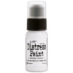
I think the most notable difference between the Distress Oxides and the regular Distress inks is their opaqueness and chalky finish. To me, they feel almost like a cross between Distress Ink and Distress Paint, and I love that unique look. Best thing is, all the techniques we’ve learned for the regular inks can be used on the Oxides, as well.

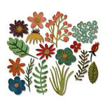
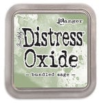
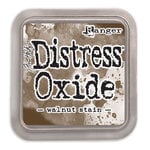
To put the Oxides through their paces, I experimented with all my favorite techniques here. There’s ink smooshing and ink blending. I stenciled and stamped, and watercolored with the Oxides, too. I even played around to create some Oxide stripes and polka dots… a little funky touch to go along with these Tim Holtz Funky Florals dies.

I’ve got the full step-by-step tutorial up on the Ranger Ink blog, if you’d like to learn more.
Hope you all had a wonderful weekend! We hit 80 here, and yucky green pollen is coating everything. The carpenter bees are in full swing, too. But today we’re back down to a low in the 40’s. What a crazy spring.
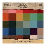
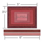
The supplies I’ve used are linked and/or listed below:
(Affiliate links used where possible at no extra charge to you)


Stampin’Up Twine

Awesome card and beautiful job with the inks!
You’ve showcased the oxide inks so well with your gorgeous card!
I’d love for you to link this up to the Cropstop blog where it’s always “Anything Goes” as long as you use a product or two from companies they carry in the store. (You did!)
The current link party can be found here: https://cropstop.blogspot.com/search/label/link%20party
I always love seeing your creations especially with Tim’s products. The card is fantastic!
Layers of delight I say. Pretty mix of colors. The florals add some nice texture and some lovely focal points.
Ohhhhhhhhhhh this is gorgeous! LOVING those colors and the flowers!!!!!!!!!!! And that is CRAZY weather!!! And carpenter bees are literally my least fave creature ever! UGH!!!!!
Wow! This is beautiful! This is the best use of the oxide inks that I have seen. What a soft look they give to this beautiful card. A favorite!
What a beautiful card, Audrey! The pastel background you created is awesome – full of subtle color changes and pattern. Your pink and purple flowers are so cute! (Hasn’t the weather been strange for April?)
Oh, how gorgeous, Audrey! Beautiful inked background in lovely soft color! And, very pretty purple flowers! Stunning card!
Beautiful blooms. I love what you did with that stencil, so soft. I really want to play around with more mixed media techniques like this. Maybe over summer break!
Really sweet and pretty! LOVE the colours!
Love this! Great card!